If the chapter on the measure phase seemed especially long, it’s because the phase itself is long and requires a great deal of work. Without a strong measure phase, the team cannot move on to analyze data and make data-based decisions that drive improve and control phases. Analyze phases also require a lot of work, but that work is usually performed by Black Belts and Green Belts, who report findings to the Six Sigma team and ask for feedback about analysis and verification of analysis.
In this chapter, we’ll discuss a number of tools that might be used by Six Sigma teams during the analyze phase, but we’ll also reference other chapters and units. Units 4, 5, 7 and 8 provide in-depth information about the statistical tools referenced throughout this chapter.
Root Cause Analysis
One of the fundamental activities of the analysis phase performed by the entire team with help from identified subject matter experts is the root cause analysis. Root cause analysis is used to identify root causes for problems or defects when a team has reached the analysis phase without a clear idea of primary causation. Some of the tools described for identifying root causes in this chapter could be used in either defining or measuring phases at the discretion of the Black Belt leading the team; the FEMA described in Chapter 13 on measure could likewise be used in the analyze phase as part of root cause analysis.
The Cause and Effect, or Fishbone (Ishikawa diagram
The cause and effect diagram is called the fishbone diagram because you begin with what looks like a simple drawing of a fish skeleton. Reference the diagram below and follow the instructions to create a fishbone diagram as part of a team brainstorming exercise. You can also use these instructions now to practice a fishbone diagram based on a process or problem you have experience with.
Fishbone Diagram Macro level.

- Sketch a basic fishbone shape on a whiteboard or large flipchart. Write a summarized version of the problem where the fish head should be. Note: You don’t have to conduct a fishbone diagram only on the problem statement from the define phase. Teams might also conduct the diagram on a specific defect or issue found during the define or measure phase. For example, if the problem statement discusses the amount of waste in a restaurant, the team might have discovered during the measure phase that bread is being thrown away at a rate higher than all other food items. One of the activities handled in the analyze phase might be a fishbone diagram specifically about the reason for so much bread waste.
- Draw a fish spine and four major connectors. Label each connector as People, Process, Materials, and Procedure. Some Black Belts also include two other major connectors: Equipment and Environment.
- Explain the categories of the fishbone diagram to the team. Note that there are some places, especially with particular processes, where the various categories will overlap. Some ideas generated by the team, as they complete the fishbone diagram, might fit in more than one
category and that’s okay.
a. People reference anyone who carries out or interacts with a process.
b. Process or machine refers to the process by which inputs become outputs.
c. Procedure or method refers to the way things are done, whether by written documents or unwritten rules.
d. Materials are the inputs, such as raw goods, into the process.
e. Equipment includes the technology or machines required to handle the work.
f. Environment is the immediate area surrounding the process. - Begin with each category on the fishbone diagram, asking the team how something in that category might be responsible for a problem or defect.
- Use sticky notes to write down ideas and place them on the fishbone diagram so you can move ideas around later. You can also write directly on the diagram.
- Couple cause-and-effect brainstorming with the 5 Whys exercise described in Chapter 6. For each branch of the fishbone diagram, ask “Why?” at least five times to ensure the most granular detail possible.
- Once the team has run out of ideas for the first category, repeat steps 4 through 6 for all other categories.
- Take some time as a team to review the diagram, discussing the placement of potential causes, and moving them to appropriate categories and subsections to create an organized visual representation.
- Remove or cross-out causes that don’t prove to be valid after initial discussion.
- As a team, decide which root causes seem most likely or highest priority. Circle those causes as high-priority possibilities for further investigation.
Cause and Effect Brainstorm Example
To provide a better idea of how a fishbone diagram works, consider the example image below and we’ll walk through how the team came up with the information recorded on the procedure/method line of this diagram.

The team above was working to solve a problem of burnt cakes in a food-service bakery. When discussing the method by which the cakes are being baked, the team first came up the with the reason that the cakes were being baked at inconsistent times. Perhaps, suggested one team member, staff weren’t paying attention and were leaving cakes in the oven too long. The idea was written down. The instructions for baking cakes are vague, said another team member – this time, a subject matter expert from the bakery. “Why?” asked the team. The subject matter expert responded that the instructions in the bakery don’t take various types of cakes into account, leaving staff guessing about bake times for some cakes. Further “Why?” questions helped the team determine that new cakes were added to the menu without the overall instructions for bakery staff being updated.
After digging deeper into the inconsistent baking times, the team again asked themselves how methods could be responsible for burnt cakes. Someone suggested that the temperature in the oven was too hot, and the team tied that suggestion to the same root cause as the inconsistent bake times. Upon final review, someone noted that the suggestion that staff not paying attention was a cause wasn’t valid, because the bakery was equipped with alarms that sounded when baking time was done. The team crossed that idea off the diagram. In this case, the Six Sigma team might prioritize the fact that instructions are not available for all types of items being prepared in the bakery. Because this would likely be a simple and common-sense improvement to make, the Black Belt might even assign someone to begin working on the improve phase as soon as the cause was verified. Many times, the root cause is not as obvious and the solution for the cause even less obvious, requiring additional analysis and validation before moving forward.
Root Cause Verification Matrix
Once teams identify possible root causes, they must verify that the causes are valid. Root cause verification can be completed via a variety of methods, including statistical analysis, design of experiments, logical questioning, observing a process, gathering additional data, analyzing data via graphical representation, and mapping processes at a more granular level than accomplished in the define phase. While this chapter touches briefly on statistical analysis and graphical representation, those topics, as well as experiments and process mapping, are covered in later units. Whatever method is used to validate root cause assumptions, the Six Sigma team should document it. Documentation regarding root cause verification is usually completed on a matrix that includes the problem, possible root causes, the verification method, why the verification method was chosen, results of the verification, and, in some cases, whether a senior Six Sigma leader, such as a Master Black Belt, agrees. A template for such a matrix is included below, but teams can also create similar documents in Excel or Word.
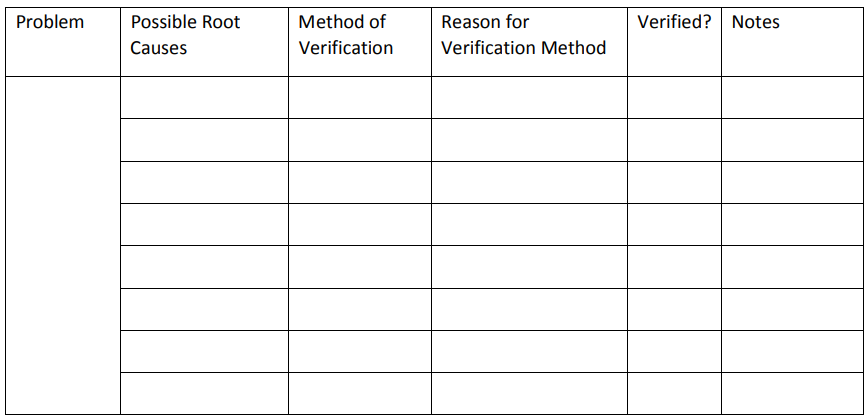
The root cause verification matrix for the burnt cake example might be completed as follows:


Graphical Analysis
Six Sigma experts and teams can use a variety of graphical analysis tools to help generate ideas about root causes or understand how inputs and outputs really impact each other. Some of those graphical analysis tools require statistical analysis software, and those will be covered in later chapters. In this section, we’ll look at a few graphical representations you can create easily with Excel. Pareto Chart The first graphical tool for validating root causes is the Pareto chart, which was covered in chapter 5. Chapter 5 discussed the Pareto Principle, or 80/20 rule, which says that 20 percent of the causes lead to 80 percent of the results. Because of this, a Pareto chart is a good starting point for root cause brainstorming – teams can start with the few inputs or attributes accounting for the bulk of the Pareto chart. Just as you can “drill down” using the fishbone diagram, asking deeper and deeper “Why?” questions, you can drill down using a Pareto chart. Consider the Pareto chart illustrating reasons for medical claims denials from Chapter 5.
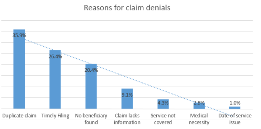
In this case, the team might decide to concentrate on the top two claims denial reasons: duplicate claim and timely filing. The team could use various methods for digging deeper into root causes for these two claims denial reasons. They might perform a fishbone diagram to discover why duplicate claims are being generated. To understand the timely filing problem, teams might gather additional data for graphical analysis.
Timely filing means that the claim was not originally filed with an insurance company prior to the deadline for claims submission. Different insurance companies have various timely filing requirements, and the countdown usually starts at the time of service to the patient or the time of discharge from a facility. The team might want to understand which payers are denying claims for timely filing, so they collect data as follows on how many timely filing denials are associated with each payer. Because Pareto analysis is concerned with the top few, you can lump the many others together in a single entry and, for the purposes of the Pareto analysis, ignore them. A medical provider might bill claims to dozens of providers; including every provider on the data table and Pareto chart would be a waste of both time and space for this particular exercise.
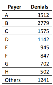
Converted to a basic Pareto chart, the data is illustrated in the graph below.
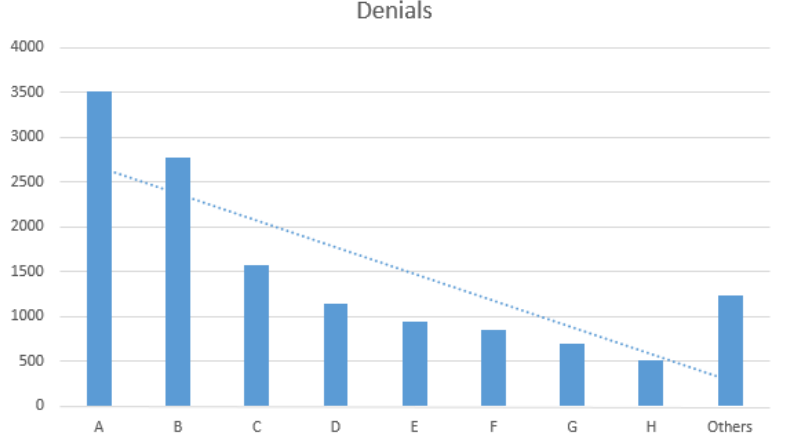
It’s easy to see from the graph that the bulk of the problem is with payers A and B; perhaps these companies have shorter timely filing guidelines than the other companies or billing staff is unaware of the proper timely filing requirements for those payers. Six Sigma teams can begin asking questions specific to these payers as they continue analyzing data and discovering root causes.
Box Plots
Box plots are another graphical representation that can be handled with Excel. In later chapters on statistical analysis, we’ll cover how box plots can be related to hypothesis testing and other analysis. When differences between distributions are marked, however, or when outliers are fairly obvious within data, the image of a box plot tells its own story without requiring advanced statistical knowledge. Box plots are often called Box-and-Whisker graphs. To understand how to read a box plot, consider the data table and graph below. The data table shows the time in minutes in which various runners completed a one-mile race. The results are divided into the categories Children and Adults
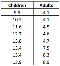
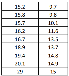

The above image shows a box plot of the data table, generated in Excel. Even without further explanation, you can likely tell that the children completed the race on average slower than the adults. The blue box, which represents the children, is shorter than the orange box, indicating that the middle 50 percent of children completed the mile-long run in times that had less variation than that of the middle 50 percent of adults. To understand how this conclusion was arrived at, we’ll take a look at all the elements of a box plot.
A box plot begins with the upper and lower hinge – the top and bottom of the box. The top represents the 75th percentile; the bottom represents the 25th percentile of the data. The line within the box represents the 50th percentile. Within the box are the 50 percent of data points between the 25th and 75th percentiles.
Each box plot receives upper and lower whiskers indicating the range of most of the other data within a set. In this case, Excel creates whiskers that extend to the top and bottom of a range barring any statistical outliers. Some statistical analysis software or methodologies use other methods to create the whiskers with very similar results.
Finally, since all plot points must be represented on a box plot graph, outliers are indicated with dots. You’ll see a blue dot above the children’s box, representing the data point of 29 minutes. That particular point is a statistical outlier; Six Sigma teams who note outliers on box plots should consider the data that is shown as an outlier. If an explanation can be found for the outlier, it can be ignored. For example, if the child who took 29 minutes to complete the mile was much younger than the other children or was walking with an injury, the data point is explained and can be excluded from further analysis.
In addition to calling out outliers, box plots let you compare two distributions graphically to see if, as in the above example, there are obvious differences between the data sets. Box plots are useful in comparing how various attributes impact a process. Six Sigma teams might compare process results for different operators, different times of day, different teams, or using different inputs. It’s important when comparing data in this fashion to only alter one attribute or input; otherwise, you won’t be able to tell what the cause of any difference between data sets was if a statistical difference does seem likely on a box plot.
Use some information for a work process you are familiar with, or use the sample data provided, to create box plots in Excel following the steps provided below.
A department manager believes that the staff on her teams would be more productive if they were able to work with two computer monitors. Because outfitting an entire department with dual monitors would be costly, the manager’s boss requires some proof that her assumption is correct. The manager equips a few stations with dual monitors and lets different team members work at the stations. She records the amount of work done within hourly increments at stations that have dual monitors as well as stations that have single monitors. Her data is featured in the table below.
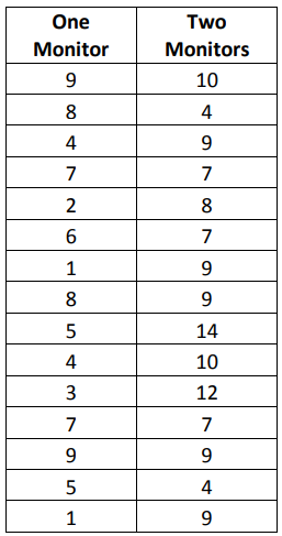
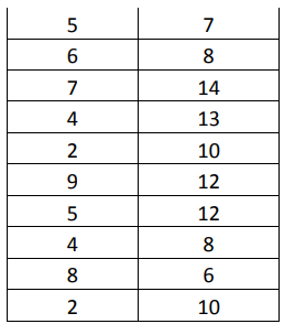
Create a box plot of the information in the manager’s data table.
- Copy the data from the table above into Excel.
- Highlight all of the data cells, including the header row.
- Click Insert > Statistic Chart > More Statistical Charts
- Select Box and Whisker and click OK.


5. Using normal Excel chart editing functions, edit the title and data labels of your chart as desired.

While a Six Sigma Black Belt would be able to back up the conclusion with hypothesis testing or other analytics, the manager might get her request for monitors approved with nothing more than this box plot. It’s easy to see that the second monitor did increase production capability for staff. Another thing worth noting is that the distributions for each of the boxes and whiskers is similar, which is somewhat expected. High producers are still going to produce the most, and low producers are still going to produce less than high produces, even if everyone is producing slightly more with the new set-up. Note that the two examples used in this chapter used data sets that were different enough to be visually noticeable on a box plot. This isn’t always the case, which is why box plots and other graphical representations are often only the starting point for analysis.
Statistical Analysis
Because statistical analysis is covered in several future units, this section lists some common statistical analysis tools with definitions.
Using this data, the team creates a scatter diagram with a trend line, as seen below.
Hypothesis Testing
Hypothesis testing lets Six Sigma experts draw conclusions about the population based on statistical analysis performed on a sample. Because the conclusions are based on samples and not the entire population, there is always some risk of error. You might have seen or heard poll results given with a plus/minus in the result: “60 percent, plus or minus 2 percentage points, would vote for the candidate today.” That plus/minus is the value for the error risk.
In statistical analysis, the risk that a sample doesn’t offer a good representation of the population is known as the alpha-risk and the beta-risk. Using information about the sample and alpha and beta risks, statisticians calculate what is called the p-value. The p-value is a probability estimate that tells statisticians how likely an assumption or conclusion drawn on sample data will be incorrect. Statistical software removes a lot of the manual calculations from the process of setting up and running hypothesis tests. With Minitab, for example, Six Sigma experts can conduct hypothesis tests on prepared data with a few mouse clicks. They do have to know which types of hypothesis tests to use in which situations.
Correlation and Regression Analysis
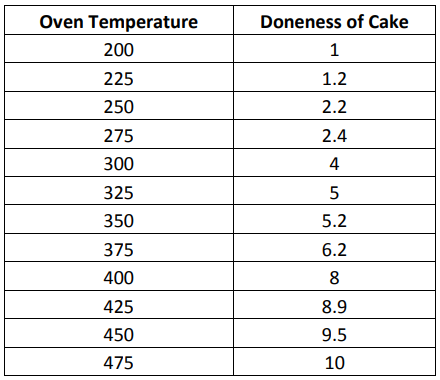
Regression and correlation analysis helps Six Sigma experts understand how variables within a process might be related. Regression analysis helps teams define the relationship between one independent variable – possibly an input – and one dependent variable – possibly an output. Does the temperature in the oven have a relationship to whether the cake is baked correctly, and how close are the two things related? Does the number of hours a person works have an impact on his or her productivity – can the team show a correlation between lower production as employees approach the end of a shift? These are the types of questions that regression analysis can answer. To work with regression analysis, both of the variables being studied have to be in numerical format. To conduct a regression analysis regarding the relationship between oven temperature and whether a cake is baked correctly, a Six Sigma team baked cakes at varying temperatures and rated them numerically on “doneness.” A rating of 1 indicated the cake hardly cooked at all; a rating of 5 indicated a perfectly baked cake. At 10, the cake was completely burned. The temperatures and corresponding ratings are seen in the data table below.
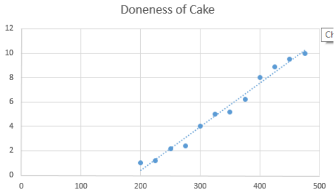
Just looking at this graph, you can tell that a relationship does exist. The data plots are gathered tightly around the trend line, which indicates that as temperature rises so does the doneness of the cake.
Design of Experiments
Correlation and regression analysis doesn’t always provide the information a team needs to determine relationships between variables, especially when those relationships are complex, or multiple variables are present. Because the analyze phase sets the stage for the improve phase, teams have to be as certain as possible in their analytical conclusions before they decide on solutions for implementation. A design of experiments can provide the more granular details and analysis required for that level of certainty. Design of experiments, or DoE, is performed via statistical analysis software such as Minitab. Teams can set up experiments for one factor or multiple factors.
Analyze Tollgate Checklist
o Primary root causes have been identified.
o Team has prioritized root causes.
o Champion or sponsor agrees with team priorities moving into the improve phase.
o Where possible, root cause assumptions are backed by statistical data.
o Relationships between variables within a process are understood.
o Where possible, variable relationships have been confirmed with statistical analysis.
