Graphical analysis is a critical part of the Six Sigma approach. Whenever data or ideas can be displayed in a visual format, obvious data trends can be quickly identified and communicated. Visual analysis is extremely helpful when presenting ideas to auxiliary staff or executives, who might not be trained in intermediate or advanced statistics. The Black Belt or other Six Sigma experts have the ability to tell the same story that statistics tell, but in a format that can be understood by anyone. Visual depictions are tools that make it easier for Six Sigma professionals or sponsors to retell the story to others, which can be helpful for training, building cultural buy-in for a process change, or even resource requests.
Throughout the first three units of this book, we’ve discussed a number of graphical analysis tools, including:
- Pareto charts in chapters 5 and 14
- Run charts in chapter 13
- Box plots in chapter 14
- Introduction to control charts in chapter 16
- Introduction to scatter diagrams in chapter 14
In this chapter, we’ll discuss additional graphical analysis tools, including bar charts and pie charts. We’ll also look again at scatter diagrams and how to create them in Excel. In Chapter 16, you learned about the components of an X-bar control chart and how to tell if a control chart indicates a process might be out of control. In this chapter, we’ll walk through the steps for manually creating an X-bar control chart in Excel. Finally, you’ll learn how to install a data analysis add-in for various versions of Excel. The add-in provides functionality that will become relevant in the next few chapters.
Additional Graphical Analysis Tools
As with many other areas of the Six Sigma methodology, it can be easy to go overboard when dealing with graphical analysis – particularly when presenting information to others. With so many tools at your disposal, it’s tempting to pick the graph that is new, exciting, or more complex. Often, though, that means spending non-value added time creating one visual tool when an easier tool would do the job. If you recall from chapter 4, this would be an instance of over-processing to avoid.
Consider the two charts below to understand when over-processing might be occurring with regard to graphical analysis.
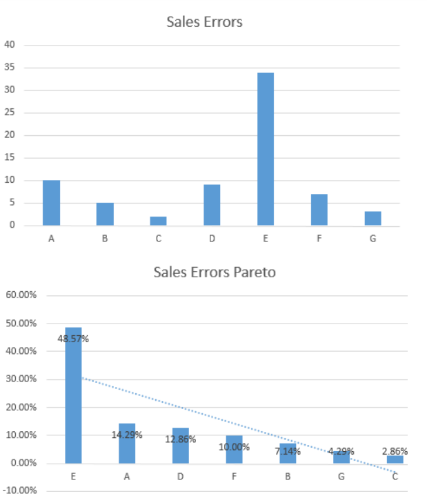
Both charts are a graphical representation of the same information. The first is a simple bar chart that was created within a few clicks in Excel. The second is a Pareto chart, also created in Excel but requiring many more clicks of the mouse. In this particular case, a Pareto chart is not necessary to convey the required information. The data is diverse enough that anyone can see from looking at the bar chart that sales person E accounts for a lot of the errors. In this particular case, a Pareto chart is overselling the conclusion and doesn’t need to be created if extra work is required.
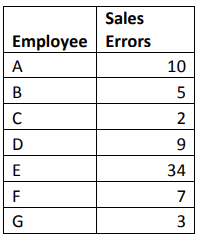
In this example, it’s possible that a visual portrayal of the data isn’t required at all: the conclusion is obvious. Looking at the raw data below, you can quickly see that employee E has triple the errors as the next-highest employee. Even when the raw data provides for easy analysis, however, many Six Sigma experts do take the time to create a graphical representation for the purpose of presentations. A graph is more visually appealing and quicker to read than a data table.
The simplest graphical analysis isn’t always the best choice, especially when data elements are not so obvious to note. More complex analysis might be required to discover outliers, relationships, and trends. Even when conclusions about data seem obvious, they aren’t always correct. This is especially true when dealing with the relationship or correlation between factors in a process.
As a Six Sigma expert, it takes time to be able to quickly choose which type of graphical analysis will best represent the data at hand. It’s also important to note that the best choice for graphical analysis relies equally on the questions being asked as much as it does on the data itself. In the example above, the basic bar chart is a good choice for a team that wants to know where errors might be coming from. If the team was comparing errors to shift times being worked, the bar chart would not be helpful.
While it’s true that you don’t want to waste time and space presenting data in a way that is not helpful – or could be considered muda of over-production – the same isn’t always true when dealing with analysis. At the analysis stage of a DMAIC project, Black Belts and other Six Sigma experts often work with numerous graphical analysis tools as they attempt to understand data. The need to view data in various ways is one reason statistical analysis software is helpful: such software takes some of the manual work out of creating these charts and graphs. Trial-and-error work with all types of Six Sigma analysis tools also helps you learn to identify which tools fit each situation best.
In this section, we’ll discuss some tools that haven’t been introduced so far, covering benefits,
limitations, and how to create the tools in Excel without statistical analysis software when necessary.
Bar Charts
One of the biggest benefits of bar charts is that they are recognizable and easy to read. Almost any employee in a company can glean information from a properly formatted bar chart without instruction or guidance, making them a great choice for general use presentations and training materials. Bar charts are also easy to create, so they are a preferred method of illustration in presentations and reports.
Other benefits include:
- The ability to summarize large data sets in a simple visual format
- The ability to clarify trends
- The fact that most people can easily estimate important values on a well-formatted bar chart
- The ability to visually check data and identify areas where data might be skewed
- The ability to easily display data sets that range above and below zero on the same chart
Bar charts typically require nominal or ordinal data – data that is classified according to qualitative information. When displaying nominal data, it’s often beneficial to create a Pareto-style chart so the reader can see instantly how the population relates to the categories. Ordinal data usually involves its own logical order for presentation. For example, if individuals are asked to rank satisfaction with a product as very satisfied, somewhat satisfied, neutral, unsatisfied, and very unsatisfied, then you usually would not want to change the order of that presentation on a bar chart. Bar charts are not without limitations. Depending on what is being presented, additional narrative might be required to explain the chart. Bar charts also often fail to reveal key information about trends that aren’t part of the specific design of the chart, and they rarely on their own provide detailed data about causes or patterns in data. Finally, it’s easy to manipulate colors, order, and layout of a bar chart to influence the message that your audience takes away. Six Sigma experts should always choose the best format for displaying fundamental truths, but should never format a chart to create an impression that might not be in keeping with the statistical data behind the graphical representation.
Create a Bar Chart in Excel
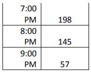
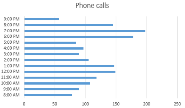
Create your own bar charts in Excel by starting with data tables of relevant nominal or ordinal data. Copy the data table below into Excel to practice bar chart creation, or use data relevant to your own processes or projects. The sample data table provides the total number of phone calls experienced by a regional customer service call-center team for each hour in a particular day.

- Highlight the columns that contain the data you want to chart as well as the labels for that data.
In this case, the data is the number of calls and the labels are the hours. - Select Insert > Chart > Bar Chart

- For this example, the simplest form of bar chart is appropriate.
- Use Excel formatting tools as desired to customize the chart title, colors, and labels.
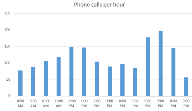
Most versions of Excel offer several types of bar charts, and you can experiment with these various formats to see how they display your data. Some notes about common formats are included below.
Column versus Bar
Technically, what is commonly referred to as a bar chart – and what we’ve been calling a bar chart here – is a column chart. The visual columns representing each data category rise vertically. A literal bar chart displays the same information horizontally. Most versions of Excel let you choose between the two displays. The information from the example data table is presented below in a horizontal bar chart.
3-D Bar and Column Charts
The charts displayed so far in this chapter are all 2-dimensional. Excel can also help you create 3- dimensional charts to add visual appeal to a presentation. 3-D charts are helpful if you are presenting a number of similar-looking charts in a row, as it helps to differentiate between information in your presentation. It might also be helpful to create more visually appealing charts simply to capture audience attention more fully. Here’s an example of the same data used above in a 3-D chart.
Stacked Bar Charts
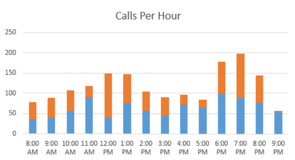
Stacked bar charts let you display the total nominal or ordinal data for each category while also breaking that information into color coded categories. For example, if the Six Sigma team analyzing phone calls per hour wanted to display data that included how many calls were handled by separate teams within a department, the bar chart might look something like the image below.
Create a Stacked Bar Chart
To create a stacked bar chart, you must have ordinal or nominal data that is broken into categories. The categories must be the same for each data set so that the total of the sub-category numbers equals the total of the main category. For example, if you have three bags of marbles, you might have data that says:

Upon further analysis, you realize you have marbles in three colors: red, blue, and yellow.

Bag 1 doesn’t include any blue marbles, but you must include blue as a category for Bag 1 because it is a category in the other two bags. You simply put a 0 in that data field. You’ll note that the totals of the subcategories under each bag add up to the amount of marbles in each bag. Following these guidelines – including all subcategories for each section and ensuring the subcategories total correctly – helps you create accurate stacked bar charts.
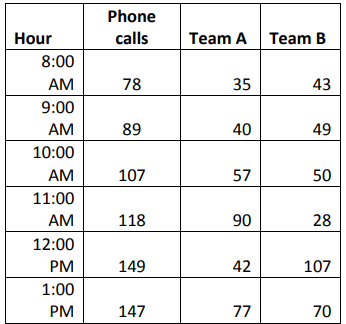
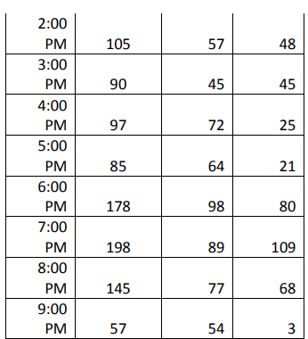
Examine the data table below, which displays the breakdown of calls by teams in the call center.
- Highlight the cells containing the data you want to include in your stacked bar chart as well
as the cells containing the data labels. - Select Insert > Charts > Bar Charts > Stacked Bar Chart

3. Use Excel’s format options to edit titles, colors, and data labels as desired.
Pie Charts
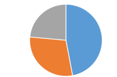
The pie chart is another visual tool that almost any employee in a business environment will be familiar with, making it a good choice for displaying certain types of information. Ordinal and nominal information can also be displayed in a pie chart with the main purpose of visually representing how each category relates to the whole. Conventional wisdom says to use a pie chart when the numbers you are charting add up to 100, but this doesn’t have to be the case. Excel converts values to percentages to create pie charts. Consider the pie chart below, which graphs the numbers 8, 5, and 4. Excel considers each of these numbers against the total “pie” of 17. The blue section, which represents 47%, corresponds to the raw data 8/17.
Benefits of pie charts include:
- The ability to summarize large amounts of specific data types in a visual format.
- Simplicity; the pie chart is one of the simplest types of graphs
- The ability to identify obvious problems with data or calculations
- Pie charts usually require very little extra explanation when labeled correctly
- Pie charts display the relevance of subset data within a total data set
The fact that pie charts are used constantly in business environments is both an advantage and disadvantage for Six Sigma teams and experts. When data can be depicted in a pie chart, the Six Sigma expert usually has to create less narrative to get a potential point across. At the same time, pie charts don’t always carry the weight that a more advanced statistical representation might because business employees are so used to seeing them. Other disadvantages of pie charts include the fact that they can be manipulated in much the same way as bar charts, they usually fail to easily display changes over time, and it can be difficult to visualize exact values when presented with a pie chart.
Create a Pie Chart in Excel
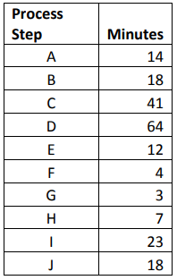
Practice creating a pie chart in Excel using the following data table, which records how many minutes are spent on average for each step of a process. You can also use data relevant to your own process or project to create a practice pie chart if desired.
- Highlight the column of data you want to chart as well as the data labels. In the example, we are
charting the number of minutes and the process numbers are the data labels. - Click Insert > Chart > Pie Chart
- Use Excel’s formatting tools to make changes to color, title, and labels as desired.
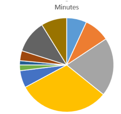
From the pie chart created for our sample data, we can see that approximately half of the total process time is related to only two steps in the 10-step process. We can also quickly see which steps take the longest on average and which are the shortest, although we can’t draw any conclusions about actual time from only this chart.
As with bar charts, you can take advantage of Excel options for creating three-dimensional pie charts. A particularly helpful function is the Pie of Pie function in Excel, which lets you create an overall pie chart and carve out a second pie chart to delve deeper into certain areas of the larger structure. Consider a Pie of Pie chart below, which represents the same data from the pie chart above.
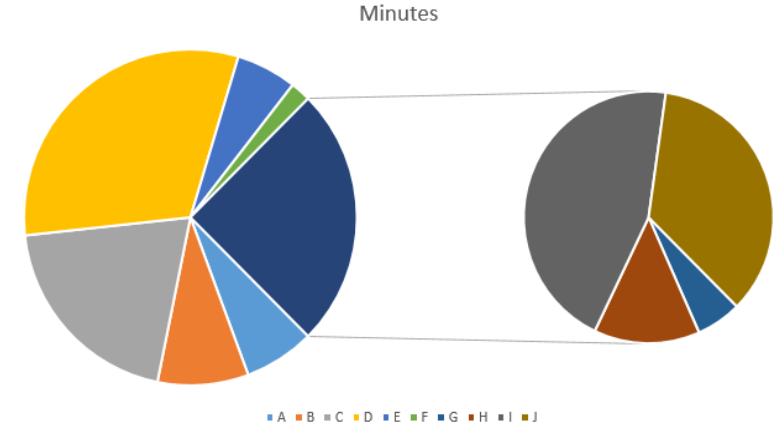
The original pie chart depicted 10 steps. The illustration above shows a large pie chart with a secondary chart. The large pie chart appears to show 7 steps – but this pie chart shows the same information as the one above. However, four steps from the process are called out in a smaller chart so you can see how they relate to each other better. Those four steps combined make up the 7th, dark-blue pie piece in the larger pie. This makes it easier to pinpoint relevance of smaller data categories within the whole or to emphasize a certain area of the chart.
You do have to be careful, however, that the viewer doesn’t assign relevance or importance based solely on the size of the pie pieces. The gray pie piece in the secondary chart above is bigger than some of the other pieces in the larger pie, but that doesn’t mean that step takes longer. The smaller pie should be considered a large-scale view of a small piece of the overall graph. In this case, that small piece takes into account four of the steps.
X Y Scatter Diagrams
We introduced scatter diagrams very briefly in chapter 14, and we’ll revisit them in depth in later chapters on correlation and regression modeling. In this section, we’ll cover how to create a scatter diagram in Excel with any analysis add-on. In chapter 19, we’ll use an add-on for Excel to conduct some statistical analysis while creating scatter diagrams.
Scatter diagrams are beneficial because they can help teams visually see the relationship between two factors in a process. Does temperature decrease over time? Does a person’s productivity increase with his or her salary? These are examples of questions that might be answered by scatter diagrams, but it’s important to realize that correlation as depicted on a scatter diagram doesn’t necessarily mean causation. Two variables can be closely related without one causing changes in the other.
Scatter diagrams typically help teams see whether there is no correlation, weak correlation, or positive or negative correlation. Positive correlation occurs when variable 2 is related to an increase in variable 1, or vice versa. Negative correlation occurs when variable 2 is related to a decrease in variable 1, or vice versa. For example, it is commonly noted that the rate of crime and the average per-capita income of geographic areas in the United States are related. Areas that demonstrate higher crime rates often also demonstrate lower income statistics. The statement can be made the other direction: areas that demonstrate lower income statistics often demonstrate higher crime rates. That is not to say that either of these things necessarily causes the other.
Drawbacks of scatter diagrams are that they are not as familiar to business employees as bar, pie, or even line charts. There is also a risk that individuals who don’t have an understanding of statistical analysis will mistake correlation for causation, which can lead to incorrect decisions. Black Belts and other Six Sigma experts must be cognizant of these risks so they can appropriately explain scatter diagrams and provide further explanation when necessary.
Create a Scatter Diagram in Excel
Use the data table below, which includes the average number of errors per hour a process creates as output is increased per hour to create a scatter diagram in Excel. Copy the information from the table below into Excel, or use data from your own process or project if desired.

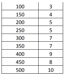
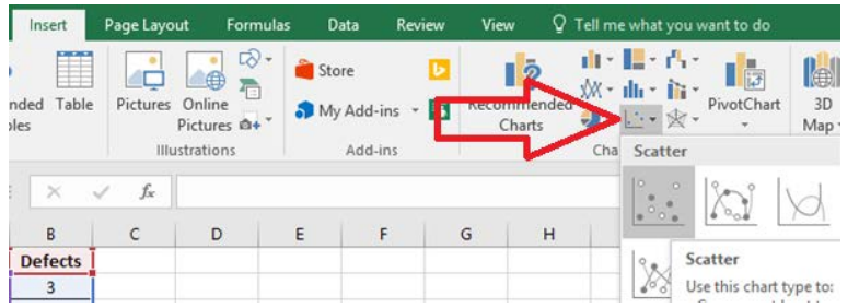
- Highlight the data you want to chart. To create a scatter diagram, you will need to highlight two
sets of data that you want to compare. - Select Insert > Chart > Scatter
- Use Excel’s formatting functions to edit colors, titles, and labels as desired.
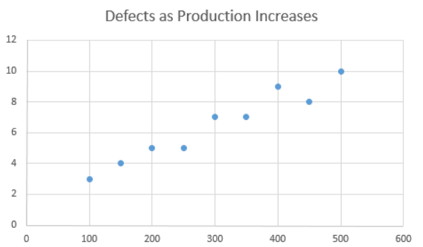
From the scatter diagram created, we can see that the two variables – production volume and errors – appear to be related in some manner. While it’s a good bet that increased production actually causes increased errors, you can’t simply assume causation from this graph. This assumption could be further tested using more advanced statistical techniques. It should be noted that, even when correlation seems obvious on a scatter diagram, it isn’t always the case. Six Sigma experts should always test correlation assumptions to ensure they are correct statistically before presenting a scatter diagram to others as an illustration of a relationship. We’ll cover statistical regression and correlation tests in chapter 19.
Creating an X-Bar Control Chart without Statistical Software
The X-bar control chart plots the mean of a sample over time – or the mean of samples taken over time, in the case of an active process. X-bar control charts are one of the most frequently used control charts. Some control charts can also be created in Excel using these steps; more advanced control charts require statistical analysis software.
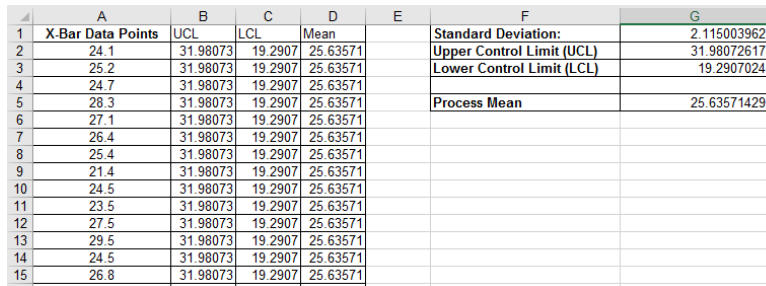
- Create the following template in an empty Excel spreadsheet.

- Enter your data points in column A.
- In cell G1, enter the formula =STDEV(A2:A15)
a. The cell references A2:A15 should be edited to correspond to your actual data list.
b. This calculates the standard deviation of your data set. - In cell G5, enter the formula =AVERAGE(A2:A15)
a. The cell references A2:A15 should be edited to correspond to your actual data list.
b. This calculates the mean of your data set. - In cell G2, enter the formula: =G5+3*(G1)
a. This calculates an upper control limit that is three standard deviations above the mean. - In cell G3, enter the formula: =G5-3*(G1)
a. This calculates a lower control limit that is three standard deviations below the mean. - In the UCL column (B), direct Excel to create a column of numbers where every number is equal to
the upper control limit by copying =$G$2 into each cell in a row that has an X-bar data point in column A. - In the LCL column (C), direct Excel to create a column of numbers where every number is equal to the lower control limit by copying =$G$3 into each cell in a row that has an X-bar data point in column A.
- In the Mean column, direct Excel to create a column of numbers where every number is equal to the mean by copying =$G$5 into each cell in a row that has an X-bar data point in column A. (Practice steps 1 through 9 with the following data.)
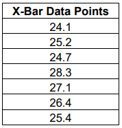
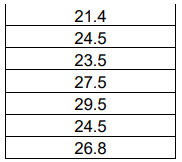
The result should be a spreadsheet that looks just like the one below.
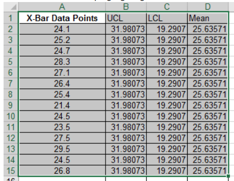
Create a control chart by highlighting the data in columns A through D.
Select Insert > Charts > Line Chart > 2-D Line Chart with Markers
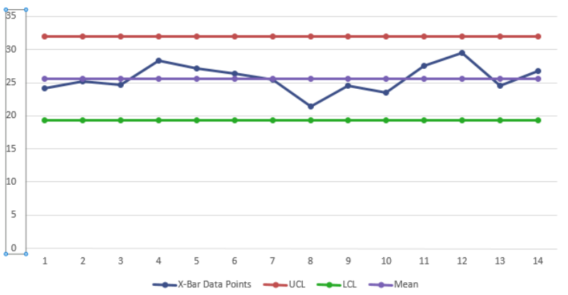
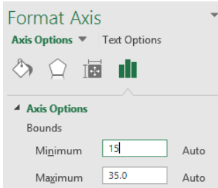
- Right click on the data labels for the Y axis and select “Format Axis.”
- Alter the bounds for the axis to remove excess white space in your control chart. In this case, we’ll
change bounds from 0 to 35 to 15 to 35.
- Format the chart as desired for color, titles, and data labels. You now have a very basic control
chart.
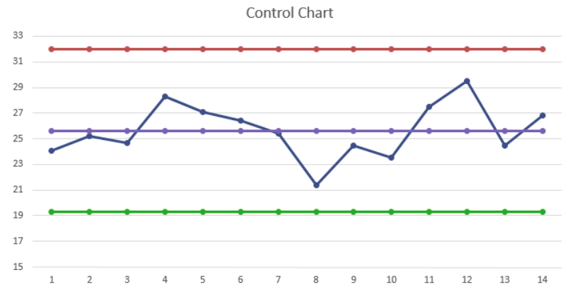
One thing you’ll note missing from this control chart is the lines that denote one and two standard deviations above and below the mean. In chapter 16, you learned that those lines help you apply the tests that determine if a process is in control or not. You can easily add those lines by following the steps below.
Add Standard Deviation Lines
- Add calculations to your spreadsheet for:
a. The mean plus one standard deviation
b. The mean plus two standard deviations
c. The mean minus one standard deviation
d. The mean minus two standard deviations - Add four data columns, one for each of the calculations in step one. Copy the numbers from each of the calculations down the columns as you did with the upper and lower control limits and the mean in the original instructions above.
- The spreadsheet should now appear similar to the image below.
- Highlight all of the information in columns A through H.
- Select Insert > Charts > Line Chart > 2-D Line Chart with Markers.
- Change the Y-Axis to an appropriate range.
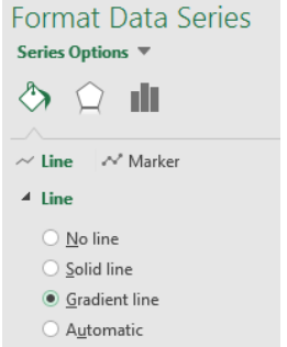
- Edit the background standard deviation lines to be less intrusive by clicking on each and first selecting the gradient line option.
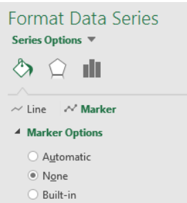
- Click on the line again and select “Marker.” Select none to remove the markers for the background lines.
Edit the final chart as desired with titles and labels.
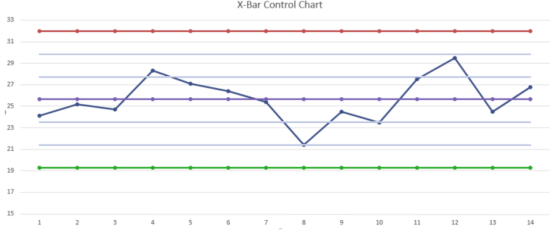
This process might seem very time consuming, but it only takes a few minutes once you are well-versed in the elements of a control chart. It’s a good idea to know how to create control charts in Excel, because Six Sigma experts can’t always rely on access to statistical analysis software.
Adding Free Data Analysis Tools to Excel
You can complete these calculations by hand, but that can be time consuming and require extremely advanced statistical skill sets. We will start with manual calculations because it helps to understand the reasoning behind an analysis. But we’ll also rely heavily on tools that complete most of the calculations. Not only does statistical analysis software minimize the time it takes to conduct such analysis, but it also reduces the chance of calculation errors and increases the accuracy of analysis and conclusions offered by Six Sigma experts.
For lessons covered in the next few chapters, you can rely on the free data analysis tool available from Microsoft for Excel. To add this free tool in Excel 2013 and higher, follow the steps below.
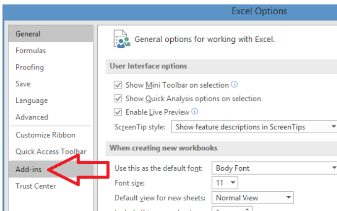
- Select File
- Select options
- Select Add-ins

- Locate the Analysis ToolPak under inactive application add-ins. Note: if the Analysis ToolPak is located under Active Application Add-ins, then it is already active and you don’t need to take any of the next steps
- At the bottom of the dialogue box, ensure that “Excel Add-ins” is listed in the Manage box, and click “Go”.
6. In the new dialogue box, ensure the option for Analysis ToolPak is checked.
7. Click OK
8. Check that the Analysis ToolPak was installed by selecting “Data” from the Excel menu bar and looking for the Data Analysis option
If the Analysis ToolPak doesn’t appear as an Add-In option, that means it wasn’t installed when your version of Excel was installed. If you are using Excel that was installed from a disk, you’ll need to locate your software CDs and either reinstall the software or complete a custom install of just the Analysis ToolPak file
Note that there are two files with the Analysis ToolPak name. The file called Analysis ToolPak – VBA is not the file that provides analytical capability.
The Analysis ToolPak is also available in earlier versions of Excel. In 2003 and earlier versions of Excel, you’ll find the Add-in menu item under Tools. In 2007, the Add-in option is found by selecting the Office button and then Excel options. In 2010, select File, Options, and Manage Add-ins.
